Trauma-informed Health Platform: Groove
Groove is an online health platform that aims to educate individuals about food and exercise through science-backed research, help develop personalized healthy routines, and provide the tools needed for success. Embracing a trauma-informed approach to health tracking, my design approach incorporates tracking methods that allow users to measure their progress without hyper-focusing on body size measurements, or meal portions, if they choose to avoid it. The goal is to balance functionality and sustainability, ensuring that the platform meets diverse user needs to help them develop and maintain healthy habits, listen to their bodies, and achieve results.
Stack

Scope
User Research, Product Design, Brand Design

Problem Statement
There's a lot of noise to sift through in the fitness industry, especially with the rise of fitness influencers on social media, people struggle with finding the right information and developing and maintaining healthy lifestyles in informed, sustainable, and enjoyable ways that are personalized to them.
The Challenge:
With noncommunicable diseases (NCDs) being a leading cause of death globally, and obesity affecting more than a third of the adult population in the U.S., Groove aims to provide a solution that could help individuals develop healthier relationships with food and exercise. However, existing health platforms are too complex, lacked personalization, or are not engaging enough to sustain long-term behavior change.
User Needs:
After speaking to 10+ individuals about their relationship with food and exercise, and their experiences with health apps – particularly tracking apps – the initial goal of creating a personalized and simplified platform for all evolved into a larger goal that prioritized mental health while keeping physical fitness goals in mind. Overall, users required a solution that was easy to use, offered personalized experiences, and provided motivation through community support.
Research
The health and fitness industry has become extremely oversaturated and competitive over the past few years, which is why I needed to better understand the market and identify areas of opportunity.
The fitness and nutrition app market is expected to grow from $19.84B in 2022 to $40.1B in 2027*, resulting in a 102.1% increase in market volume.

Every individual that I spoke to has tried at least 5 apps and services on their health and fitness journey.
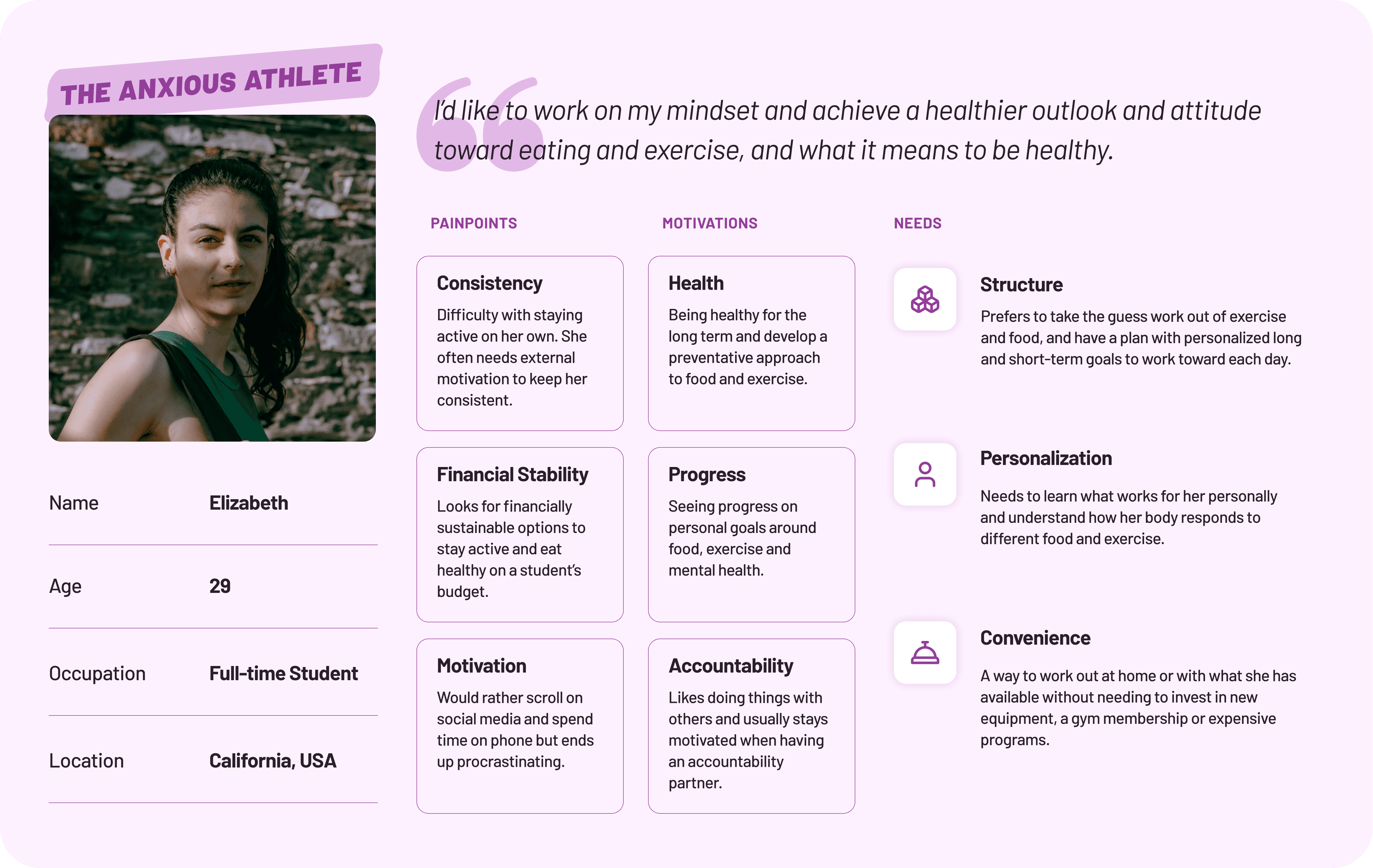
To understand the challenges and needs of the target audience, I conducted in-depth interviews with six participants aged 20-40. All participants had experience with food and exercise tracking but faced challenges with consistency and motivation.
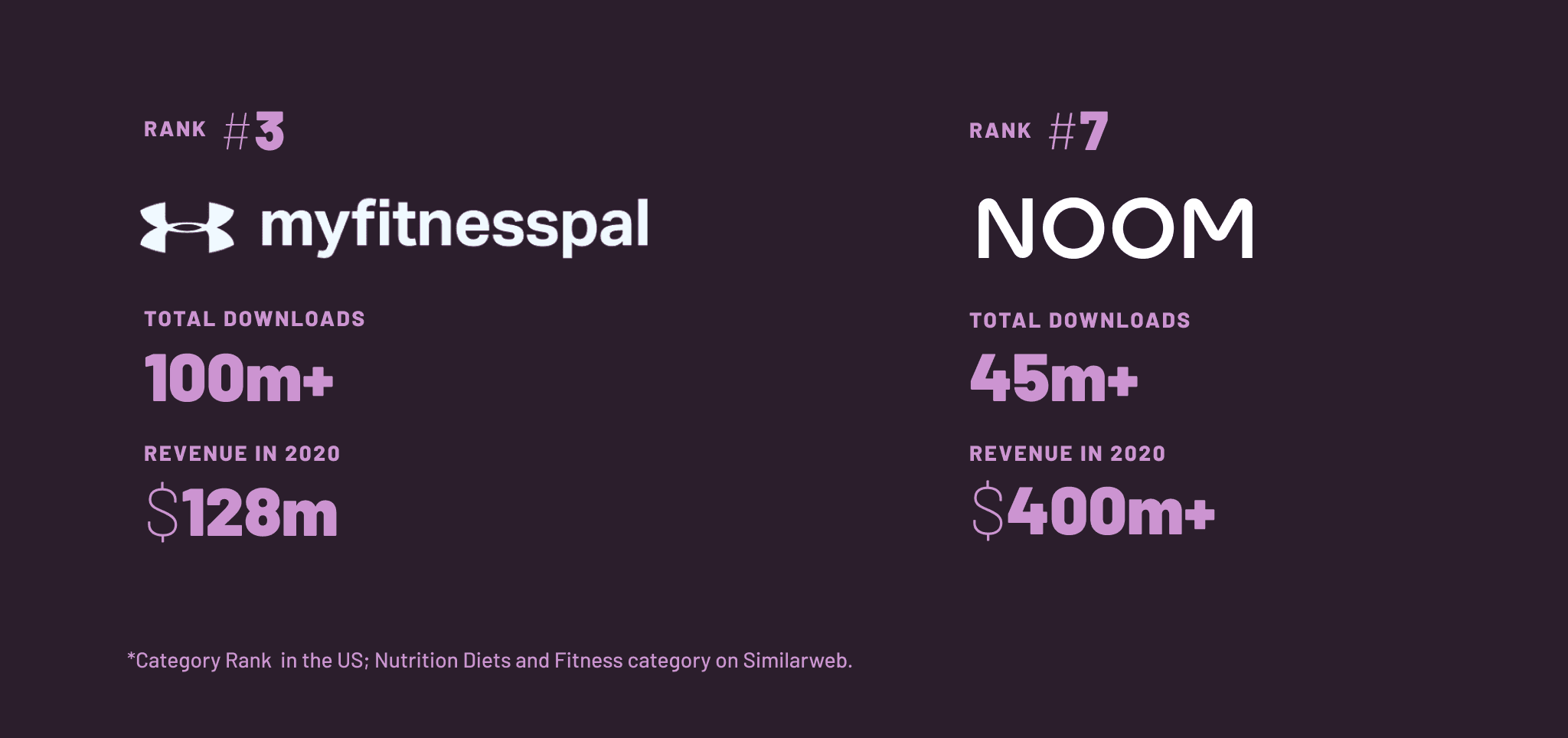
The most popular apps and services users have tried, such as MyFitnessPal and Noom, did not fully meet user needs regardless of being popular in the market.
I analyzed popular health apps to identify gaps and opportunities. The analysis revealed that while these apps offered extensive databases and tracking tools, they often fell short in areas like personalization, mental health integration, and community support.
Process
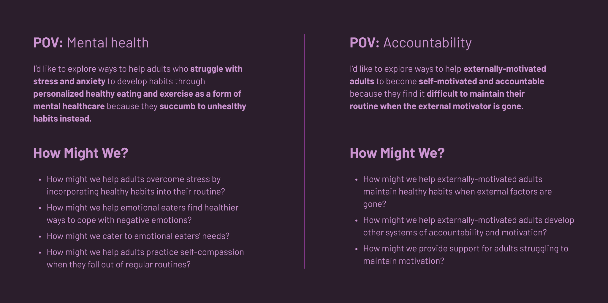
With user concerns and needs in mind, I generated a series of "Point of View" (POV) statements and extracted "How Might We" (HMW) questions to focus and guide the ideation process.
My focus was on creating a platform that could offer personalized, engaging, and easy-to-use tools for habit formation for all users. For the MVP, I wanted to ensure that mental health and user need for accountability were top priorities.
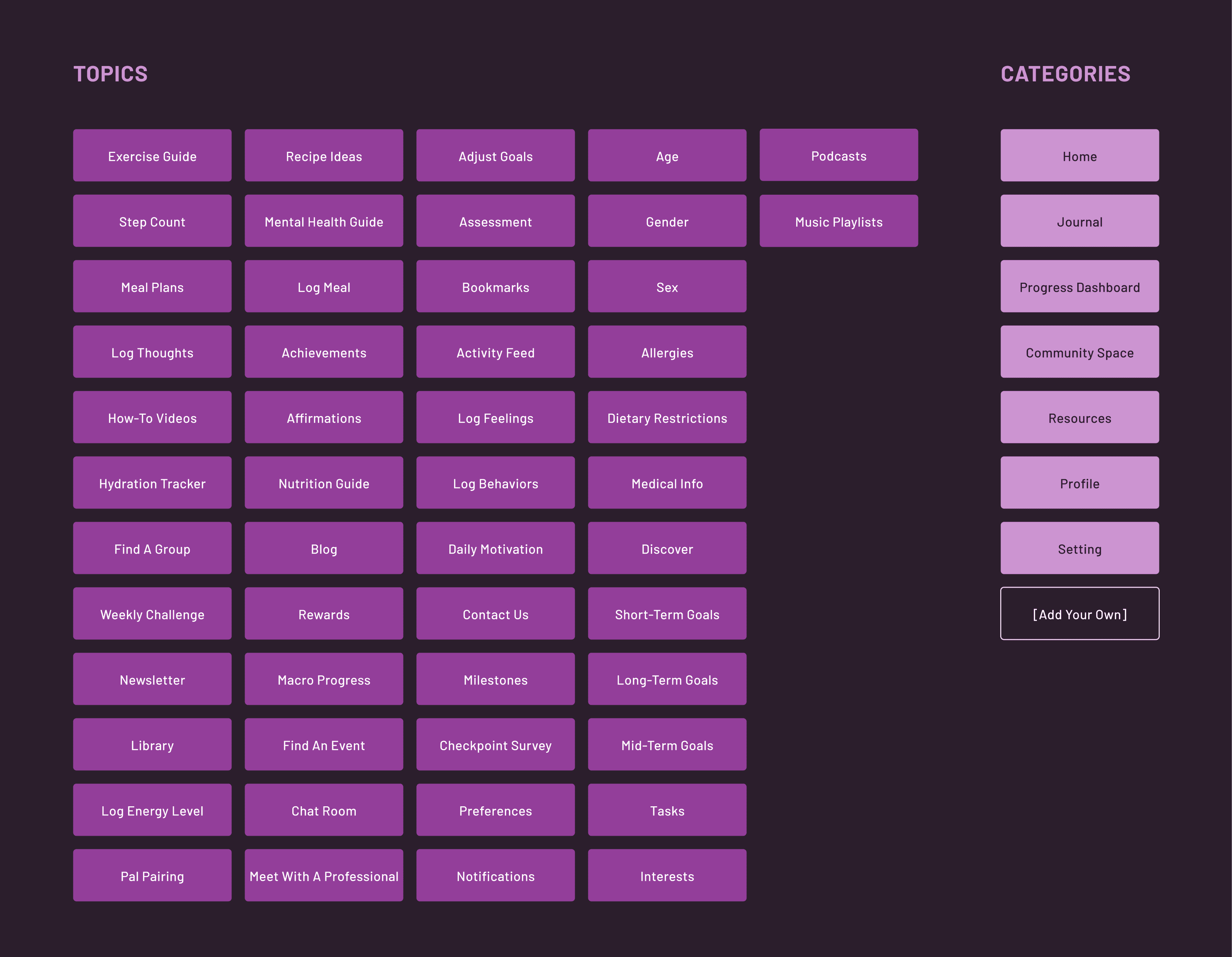
Using the design thinking methods of Embracing Opposites and Analogous Inspiration, I developed a total of 50 feature ideas and 7 predetermined categories
Seamless navigation is essential to removing any barriers to entry. Therefore, it was important to conduct a hybrid card sorting exercise to better organize the information, gain better insight into users' mental models about content groupings, and develop an intuitive information architecture for the website. The card sorting was conducted with six participants, one participant added an eighth category: Guides.
Clear structure and convenience are two primary user needs and are especially important for encouraging users to develop new, healthy habits.
However, to focus the solution on mental health and accountability support, I narrowed down the list of feature ideas to 24 topics and features that are critical to the success of the platform, closely relate to user needs and that support app functionality—then used a feature matrix to compare each feature to determine its relative value and impact to reach a solution and that are aligned with the product roadmap.

Three features became critical for the success of the MVP and supporting user needs.
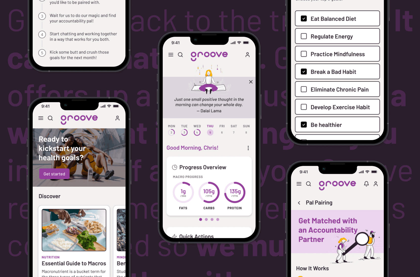
These three features are: an assessment questionnaire for personalization, trauma-informed tracking capabilities for achieving health goals with mental health in mind and community support for accountability. Once defined, user flows and task flows were created to ensure that the app's structure aligned with user expectations and business goals.

Starting with a mobile-first approach, I began with low-fidelity sketches to layout the general structure of the pages, followed by mid-fidelity wireframes to evaluate visual hierarchy and content structure to test and validate before moving on to a hi-fi prototype.
I tested the mid-fi wireframes with six participants. The main suggestions included simplifying the journal page and adding more preference options to the pal pairing flow.
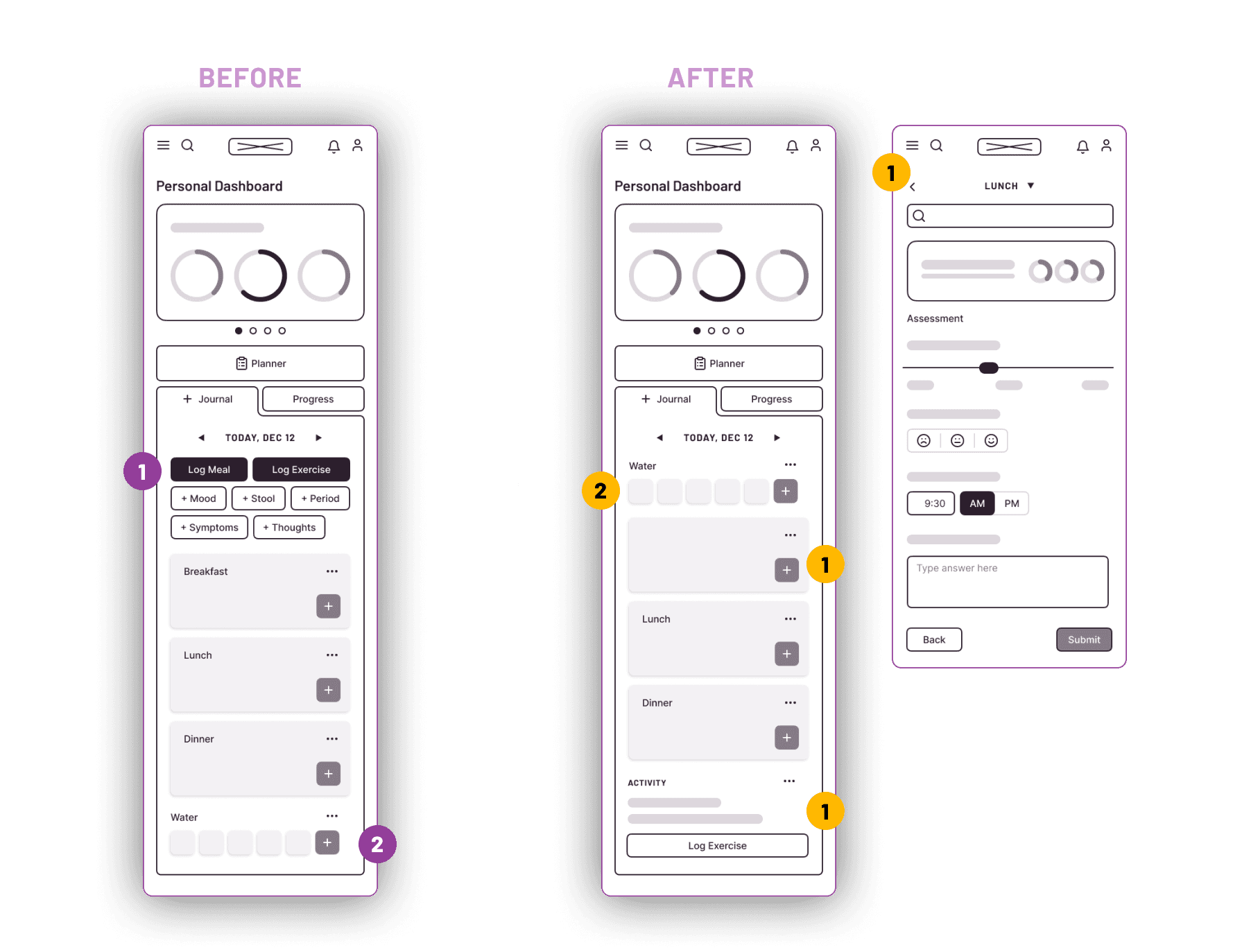
Restructuring the Journal page
Users suggested reorganizing the options on the original Journal page to avoid decision fatigue. Most users suggested moving the water tracker higher up for easy access and expanding the exercise tracking into its own section. Some of the remaining tracking options, such as mood and thoughts, were integrated into the tracking flow for each meal instead to help the user track their feelings around each meal and practice mindful eating.
The other options, tracking stool, symptoms and period, were removed from the scope of the MVP.
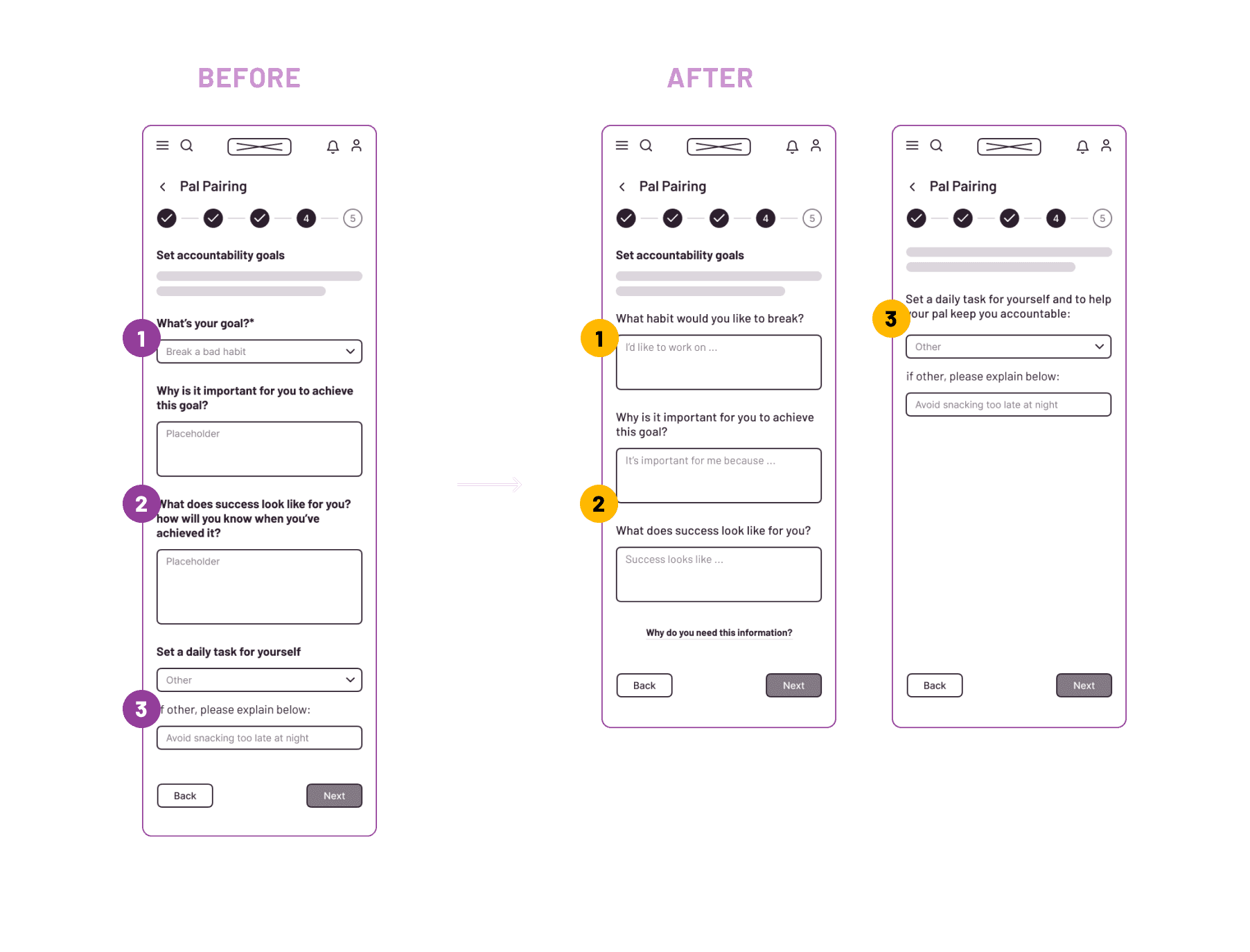
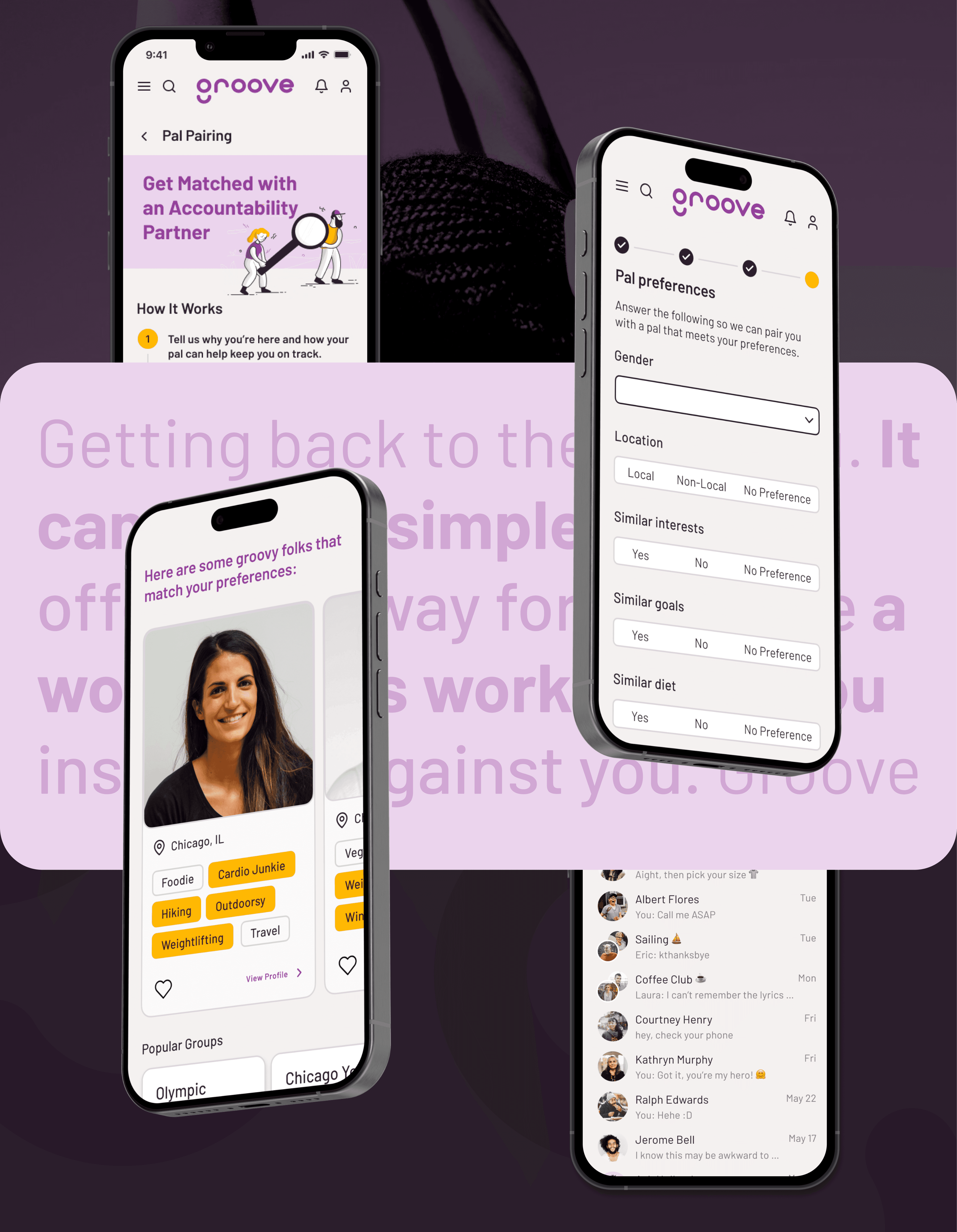
Simplifying the accountability goals in Pal Pairing flow
Users mentioned that some of the information requested in the Pal Pairing flow was redundant, namely "What's your goal?", since it was already a part of the assessment flow. The updated screen accounts for the goal that the user selected in their assessment and asks to elaborate on it for their pal to provide more context.
Additionally, users suggested breaking up the questions into a couple of screens instead of overwhelming the user with all of those fields on one screen.

Adding more flexibility and options for Pal preferences
Users mentioned that they would prefer to have more control over their pal selection, especially around sensitive topics related to health and wellness. Users suggested including options to pair with folks with similar interests or goals, specifying check-in frequency preferences and location.
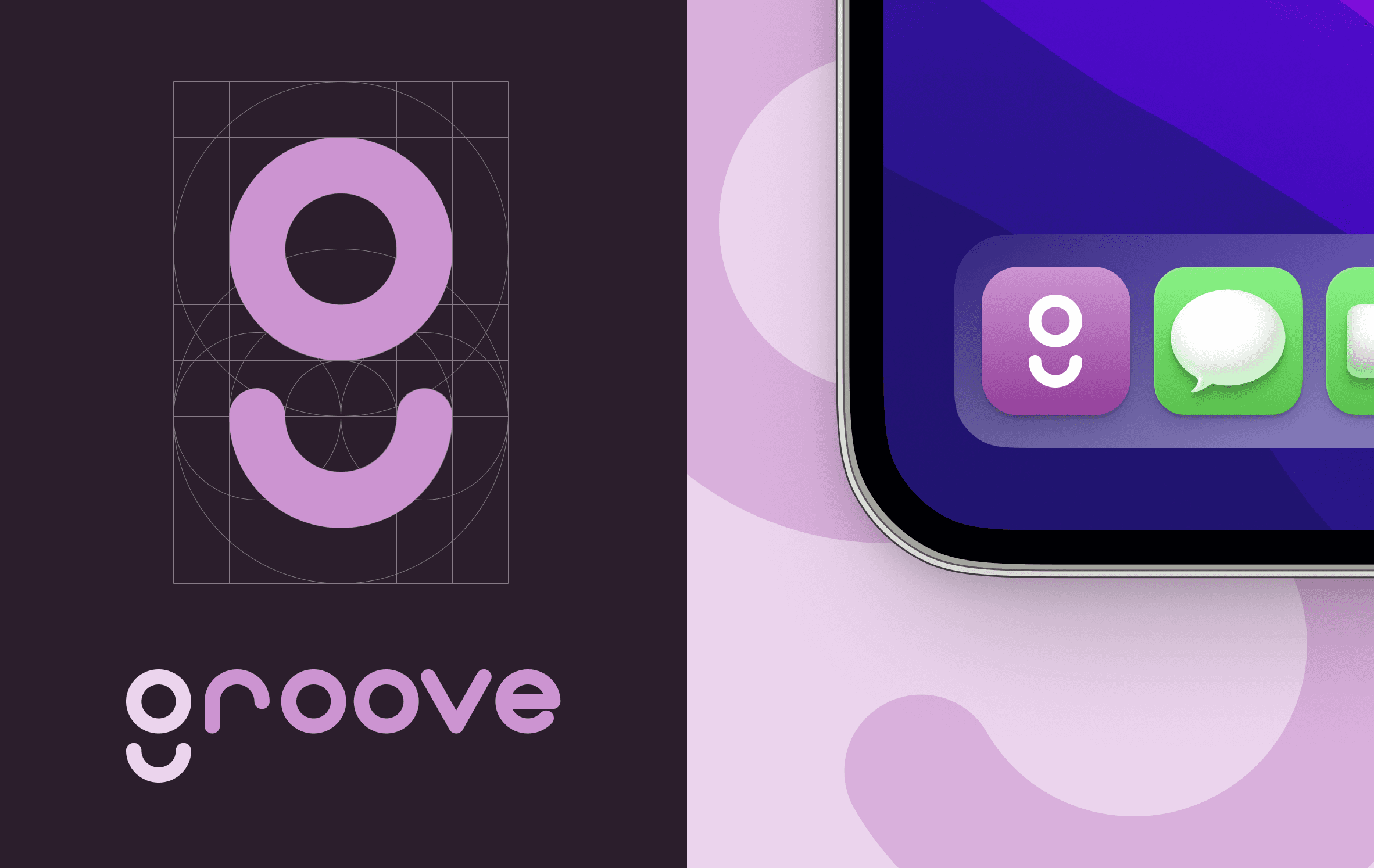
Once the foundational structure was validated through user feedback, I began building the visual identity and UI components for the Groove app
The term “groove” is a noun that means the following:
a long, narrow cut, especially one made to guide motion or receive a corresponding ridge.
an established routine or habit.
a rhythmic pattern in popular or jazz music.
Each definition supports the goals and values of the product – to support and encourage folks to live and maintain healthy and happy lives.
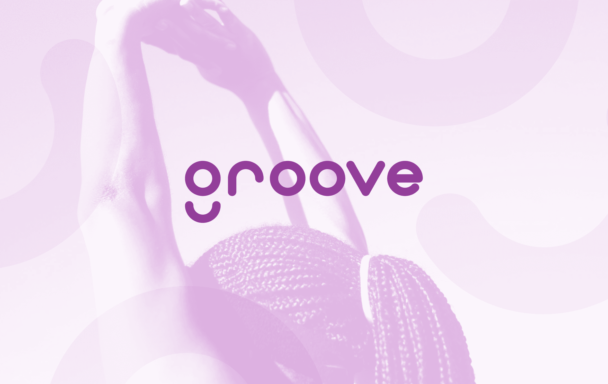
The visual identity for Groove was crafted to reflect the brand's core values of buoyancy, discovery, vitality, encouragement, and enjoyment. The name "Groove" was chosen to symbolize the development of positive routines and rhythms in users' lives.

The color palette supports Groove's values and goals with the primary Plum representing encouragement, inspiration, and creativity, and Xanthous embodying energy, positivity, and vitality.

Barlow is a slightly rounded, low-contrast, grotesque font superfamily designed by Jeremy Tribby. The typeface draws from the visual style of the California public, sharing qualities with the state's car plates, highway signs, buses, and trains. This sans serif is a strong yet soft typeface, its geometric nature makes it easy to read on various screens due to its regularity and consistency in proportions and shapes.
Designing the user flows and interaction for the new functionalities in high fidelity
Finally, high-fidelity wireframes and prototypes were developed with more attention to detail when it comes to accessibility, contrast, functionality, visual brand, and interaction to test the flows during usability testing.
Feature 1
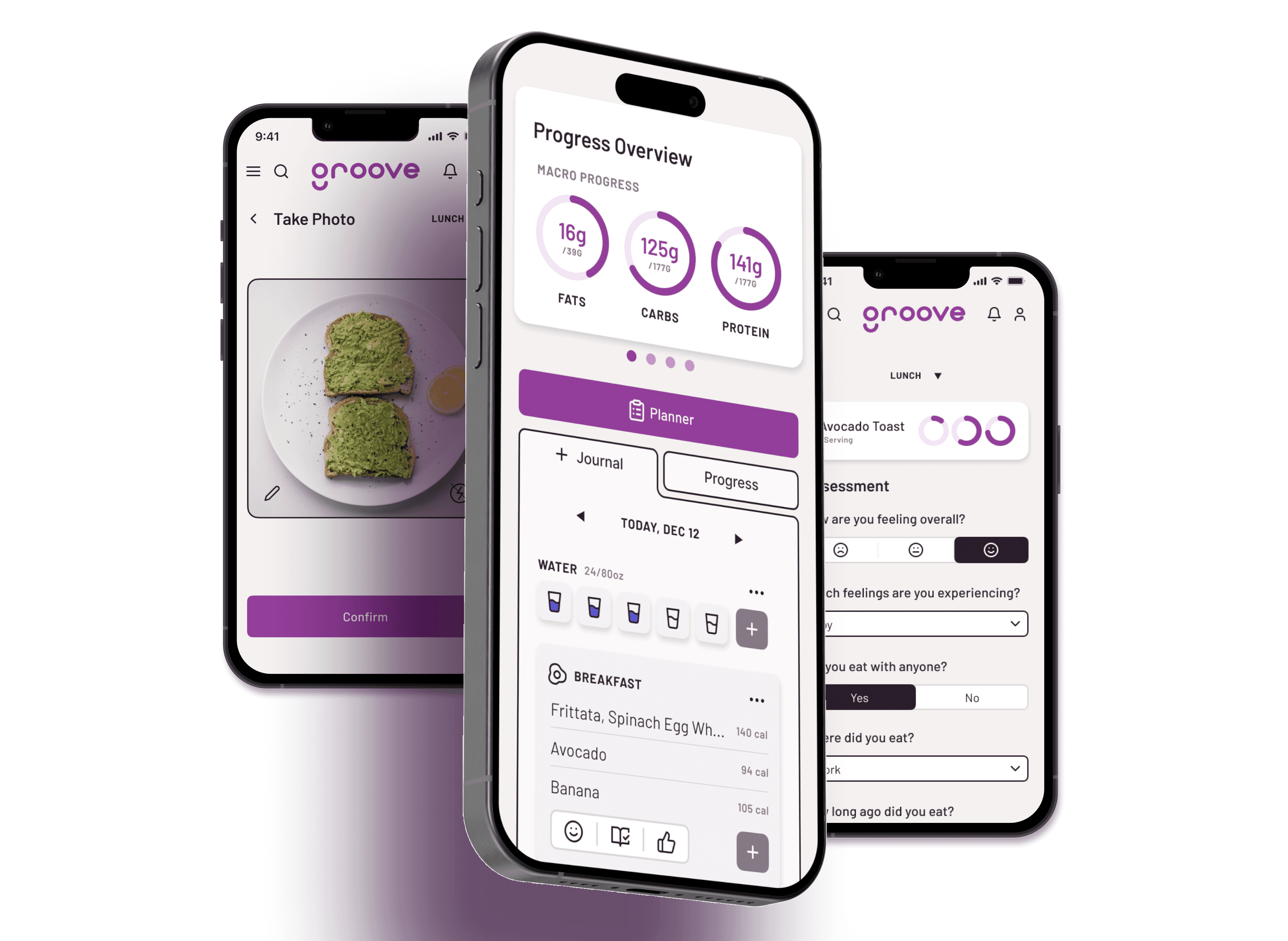
Assessment
Health is personal, that’s why it’s a priority that the solution is personal as well. The goal with the assessment is to ensure that each user receives as curated and personalized of an experience as possible by taking their health history, goals, needs and restrictions into consideration, and providing them with suggestions, content and plans that meet those needs to help them succeed.

Feature 2
Tracking
(a different way!)
Most users expressed their frustrations with existing apps and the tediousness of tracking their food, weight or measurements. Tracking these things can be triggering to users who have issues with body image or food. That’s why we’ve created a new way to track that helps users practice intuitive eating yet still be able to track their macros or stats if they choose to, without focusing on calories.
Feature 3
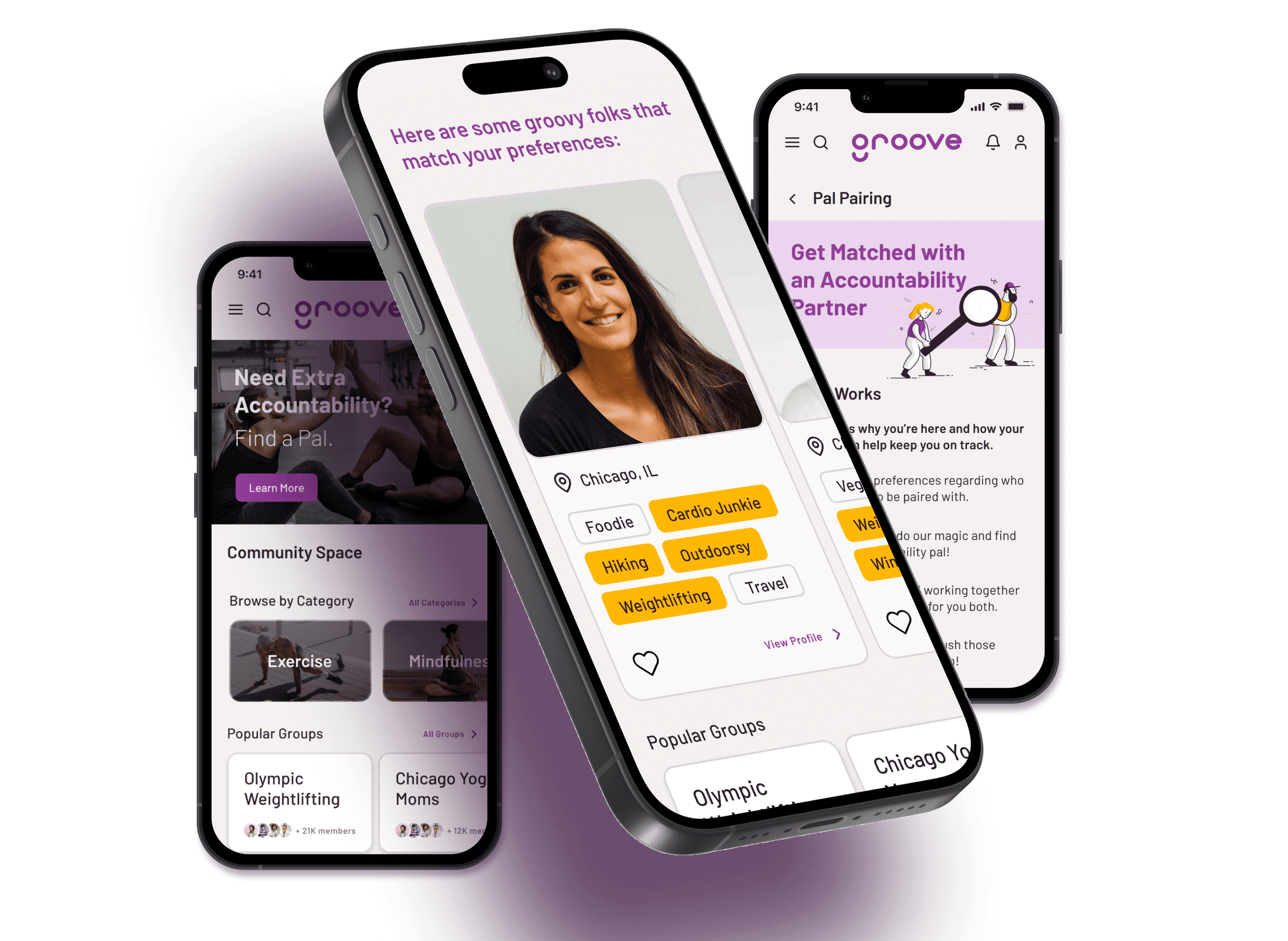
Pal Pairing
Everyone could use a little support when tackling hard things!
The most common pain point for users is accountability, and many mentioned being motivated by community. That’s where the Pal Pairing feature comes in – this feature allows users to find an accountability partner and connect with other like-minded individuals to help keep them motivated to continue working toward and achieving their goals.
Testing & Iteration
I performed testing of the first iteration of the interactive prototype with a focus on the main three features to ensure usability
10 participants completed moderated and unmoderated usability tests focused on key tasks such as account creation with assessment, meal logging, and finding a community partner ("Find a Pal"). The main insights gathered from testing revolved around the length of both the assessment and pal pairing flows. Users were concerned about the amount of data they needed to include to complete those steps which could result in users losing patience.
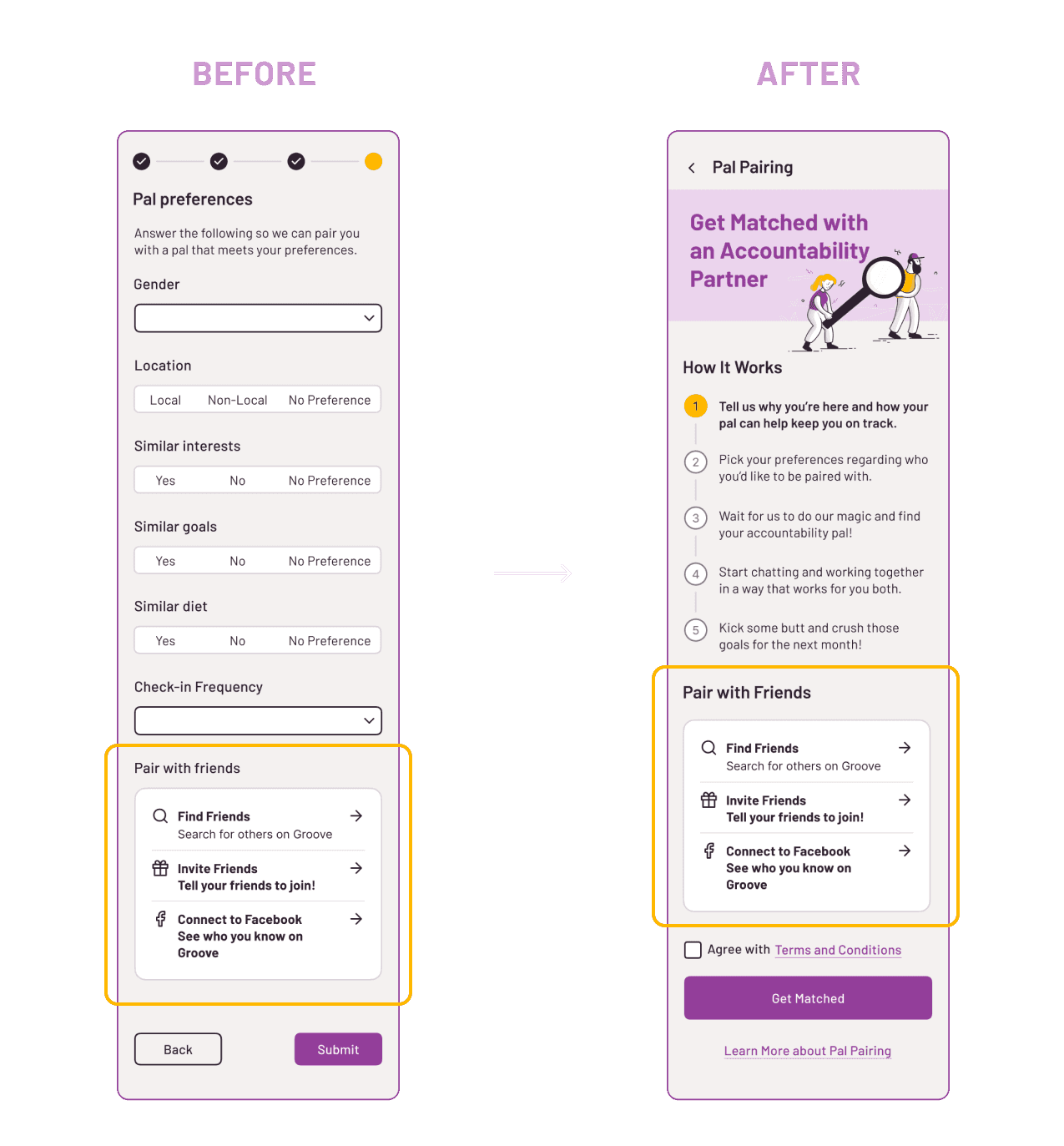
Moved "Pair with Friends"
Moved the "Pair with Friends" widget to the beginning to the Pal Pairing flow instead of the end. This way users do not need to go through filling out the screens if they choose to pair with someone they know.

Pal Pairing Flow
Option to Skip
During testing, users expressed that the account creation flow followed by the assessment questionnaire can be tedious and would like the option to skip the assessment and come back to it at a later time.

Journal Screen
Confirmation Messages
Some users seemed to not notice that the meal they logged had indeed been logged once they'e completed the meal logging task. In order to avoid confusion and verify submission, I incorporated confirmation messages after completing important tasks and submitting information.
In retrospect
As my first end-to-end project at Designlab, I delved deep into many aspects of the research and ideation process and was overly eager in tackling complex issues on my own and include many ideas in the ideation process. In hindsight, I would've done a few things differently during my process if I were to do it again.
Feature Creep
During the ideation phase, I got overly eager to incorporate a myriad of topics and features that I presented to users in a card sorting exercise which caused some inconsistencies. However, with the project timeline into consideration, I needed to backtrack to make this project feasible and refocus on the main critical features for the MVP to succeed.
Simplification
Similarly to feature creep, I was enthusiastic about incorporating UI elements that were not as necessary to the functionality of the MVP. I would start with simpler solutions before adding in more bells and whistles.
Accessibility
I would increase the size of the buttons on mobile with enough target sizing to optimize interaction for folks with physical disabilities who have dexterity needs.
Interact with prototype
Overall, the Groove app was well-received by users with high engagement levels reported during the testing phase.
The personalized approach, combined with gamification and community features, addressed the initial challenges identified in the research phase and users responded well to the personalization and community support features most of all. The Groove project has potential to be a great example of the power of user-centered design in creating products that not only meet business goals but also make a meaningful impact on users' lives. By focusing on personalization, community support, and ease of use, if fully developed, Groove can successfully bridges the gap between health and habit formation, offering a holistic approach to well-being.