Transforming a User Dashboard Interface
ACGT, Inc. is a contract molecular research service and production company that provides a continuously expanding range of DNA sequencing and molecular biology services to the pharmaceutical, biotechnology, academic, and government sectors.
Timeline
12 weeks
Industry
BioTech
Platform
Web
Year
2023
Stack



Scope
Product Design, Web Design
About the Project
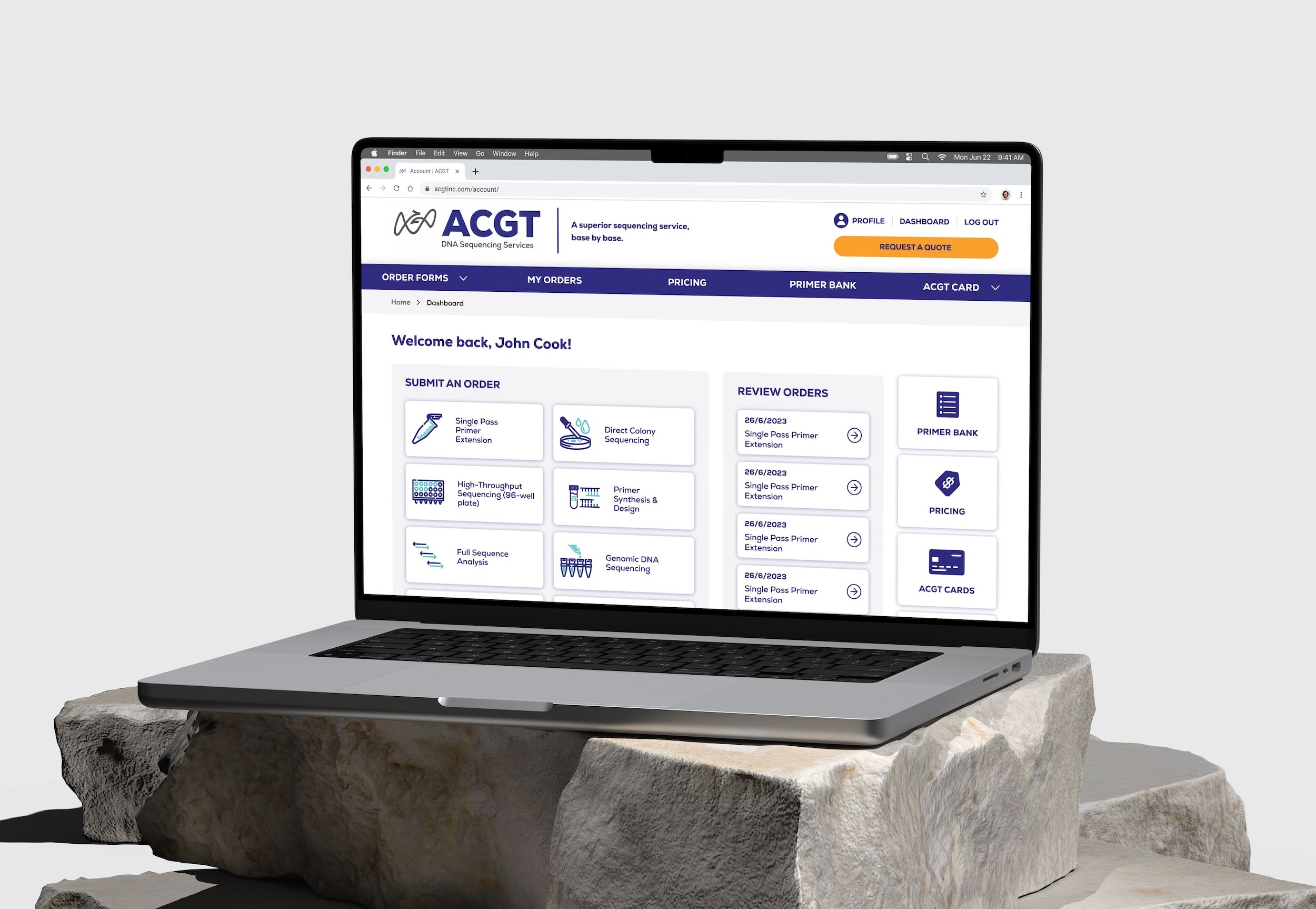
The ACGT team needed to redesign their internal web platform that allows customers from the pharmaceutical, biotechnology, academic, and government sectors to submit orders and manage, analyze and store DNA sequencing data. The platform is used by over 500 users to process large amounts of data, including the ACGT science team.
Problem
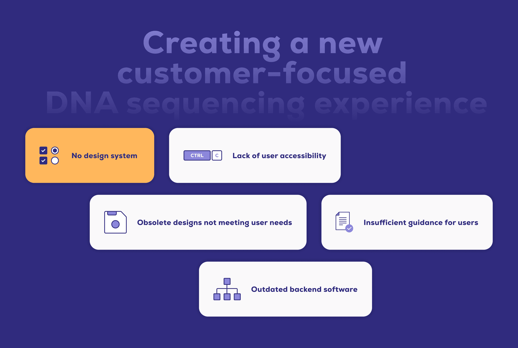
The ACGT platform is outdated and suffered from accessibility and usability issues that made it difficult for users to use efficiently. The design lacked consistency and did not effectively communicate its state or provide visual feedback for user interactions, leaving users unsure about the success of their actions.
These issues also hindered the efficiency of the ACGT science team, who relied on the platform for organizing and accessing large amounts of critical client data.
Solution
Update the design of the web platform to meet user needs, meet brand guidelines and establish a design system to develop consistency.
Solve for discrepancies in accessibility issues and improve overall user experience by incorporating visual feedback for user interactions.
Revamp the visual design to align with industry standards, creating a clean, visually appealing, and minimalistic layout that reduces overwhelm and streamlines complex processes.
UX/UI Audit
Conducted a thorough heuristic evaluation of the existing internal user dashboard to identify pain points and opportunities for improvement.
32 problems identified, the main ones being:
❓ Limited user control
No ability to save progress, undo, redo or copy elements easily.
🗂️ Lack of Consistency
Different UI treatment for different forms and lack of consistency with feedback and error messaging, field states and interactions.
🔔 Complex and Outdated UI
Lengthy and complex forms with outdated design.
ℹ️ Lack of Documentation and Help
No FAQs and documentation to help new users better understand sample submission guidelines and best practices.
Information Architecture
Redesign the overall structure and flow of the web platform in collaboration with stakeholders to create a more intuitive and relevant sitemap
UI Kit
The initial dashboard UI explorations relied on a simple Design System made of a couple dozen reusable components to ensure consistency across all platforms, and utilizing ACGT's existing color palette and visual identity.
Illustrations
Early on in the redesign, I focused on simplifying complex concepts by incorporating illustrations to pair with the UI elements. These illustrations add visual interest and make the platform approachable and less overwhelming. These will also be utilized for marketing materials and the public website.
Before and After
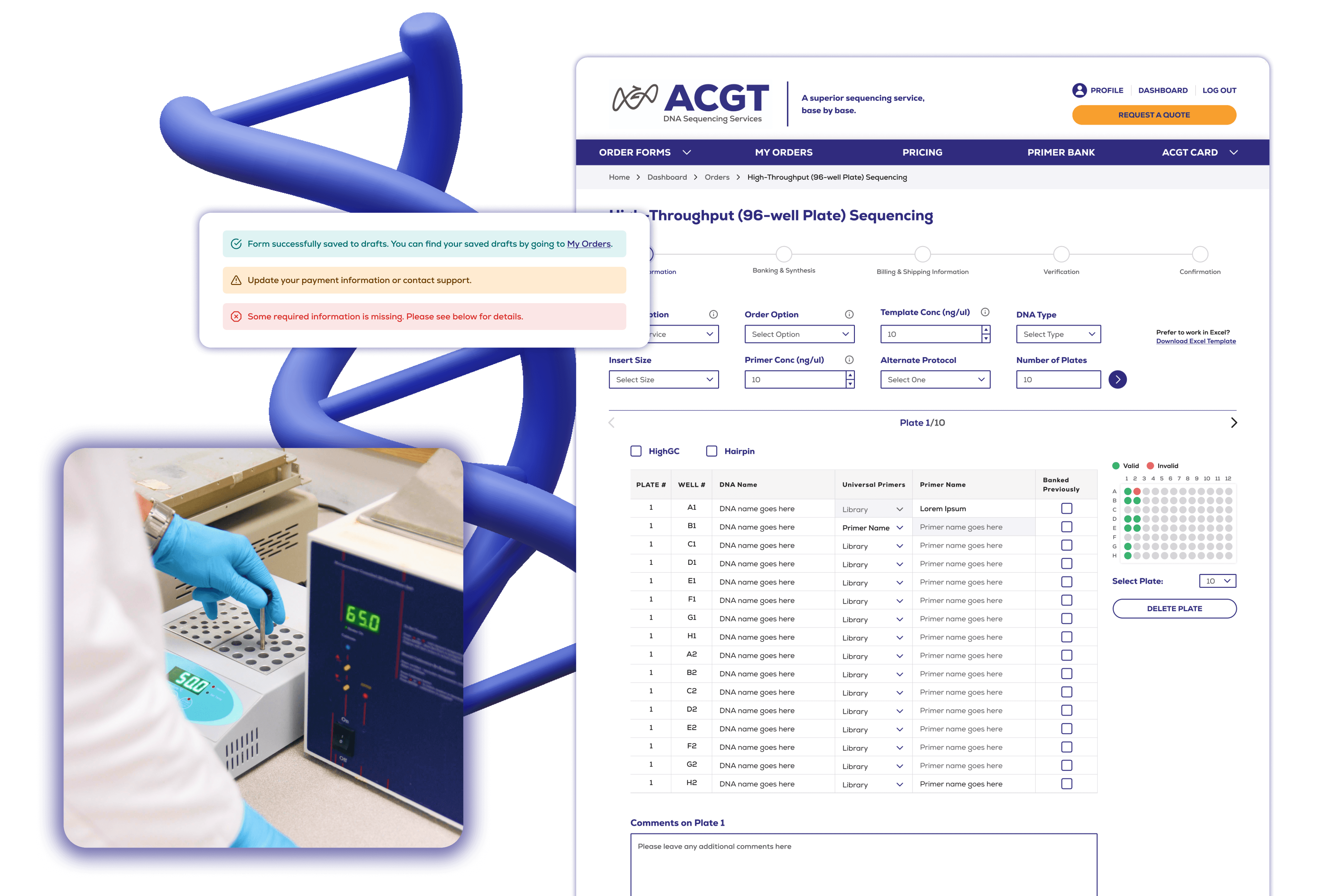
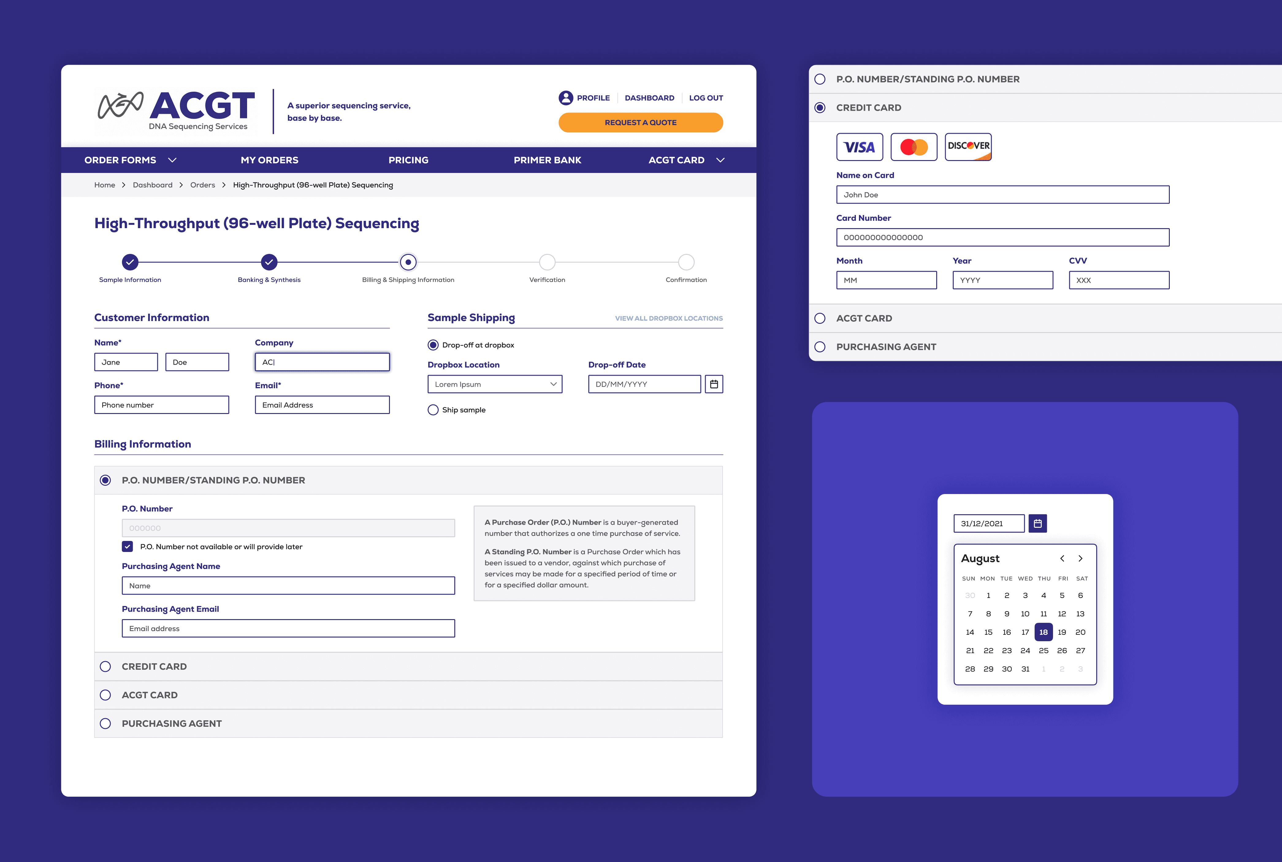
Below is an example of one of the redesigned forms available on the ACGT web platform.
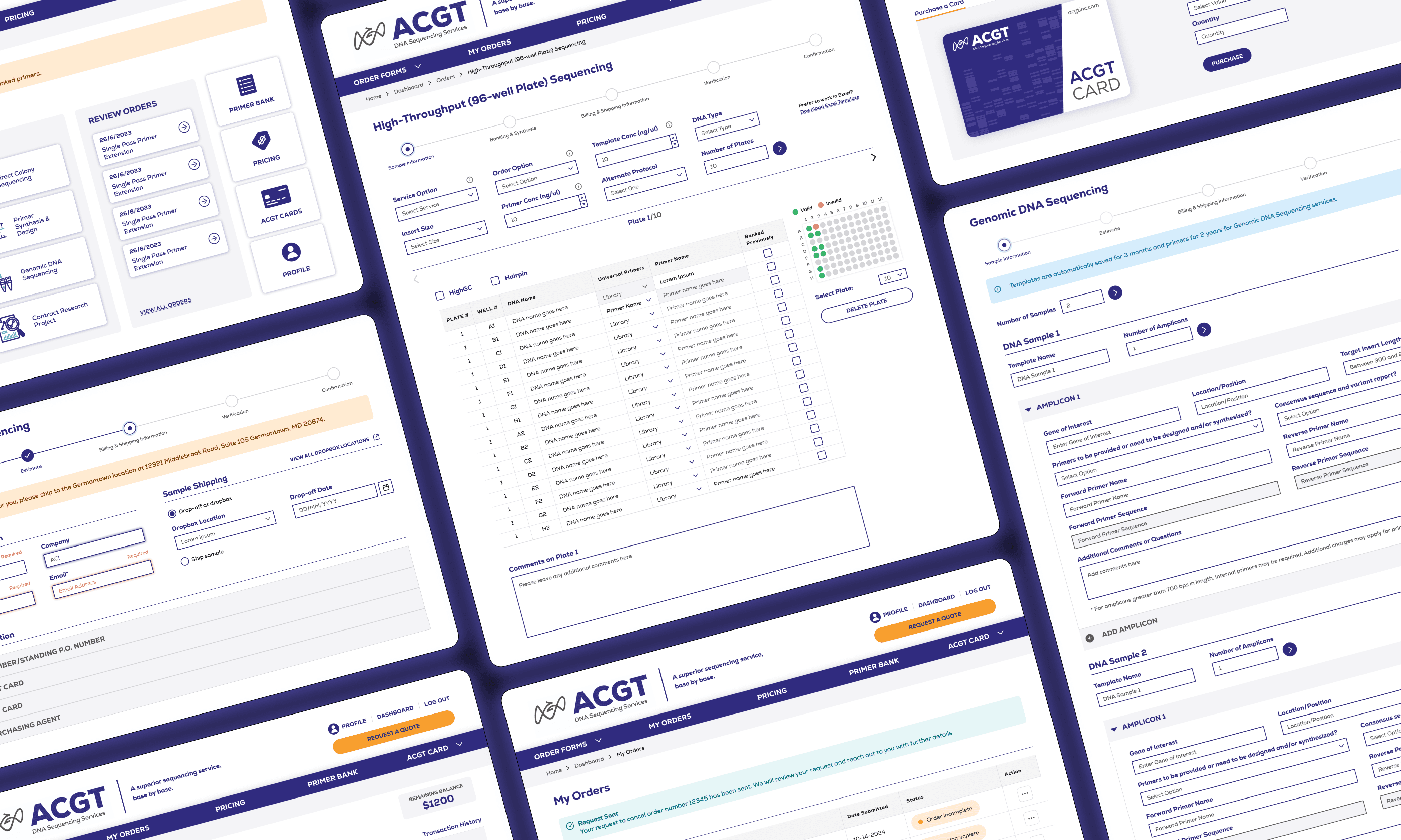
Final Screens
An interface that supports client needs by improving efficiency, ease of use, flexibility and use freedom by designing forms that allow users to use recognizable patterns and shortcuts, as well as visually representing data for accuracy.
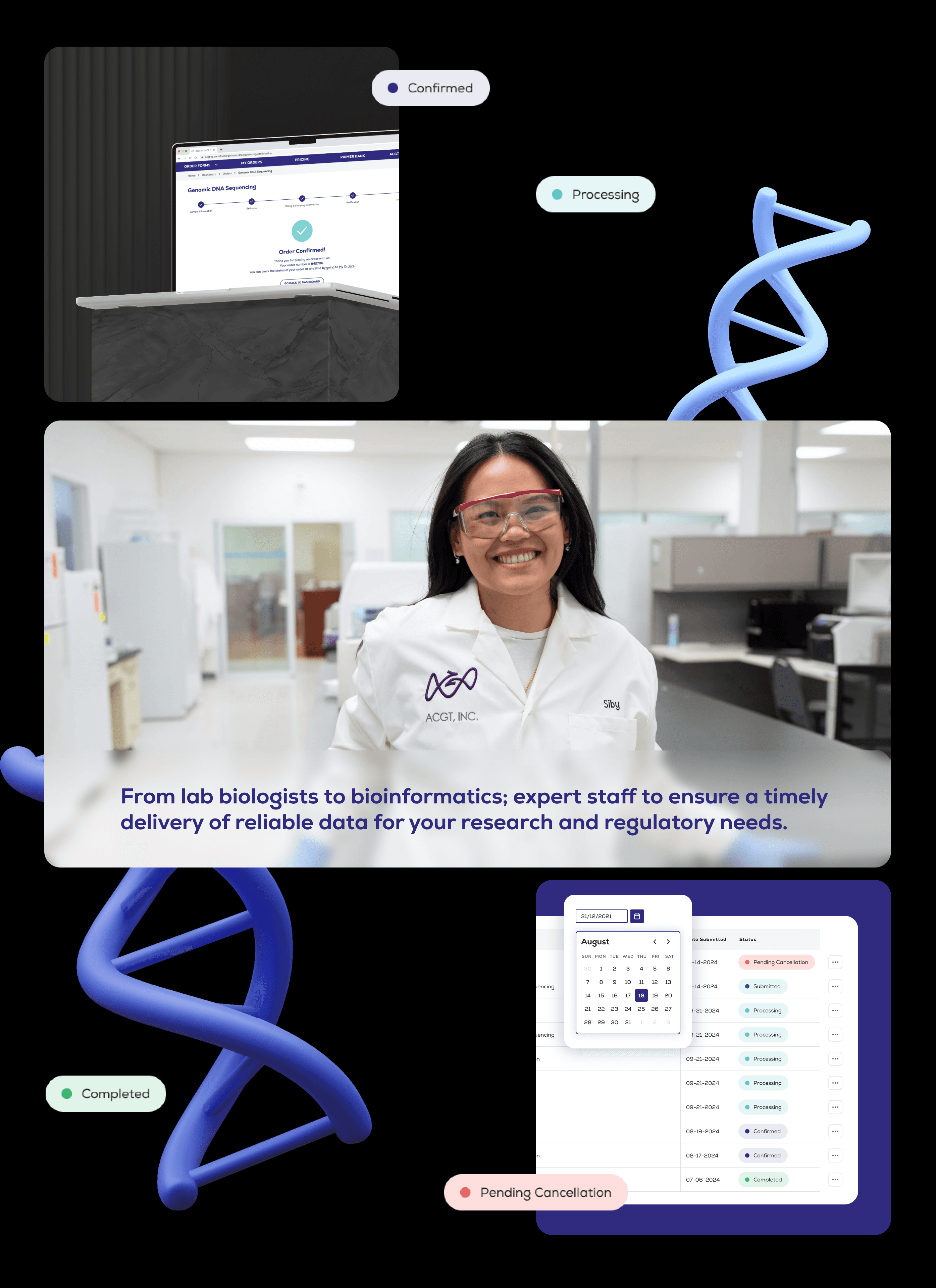
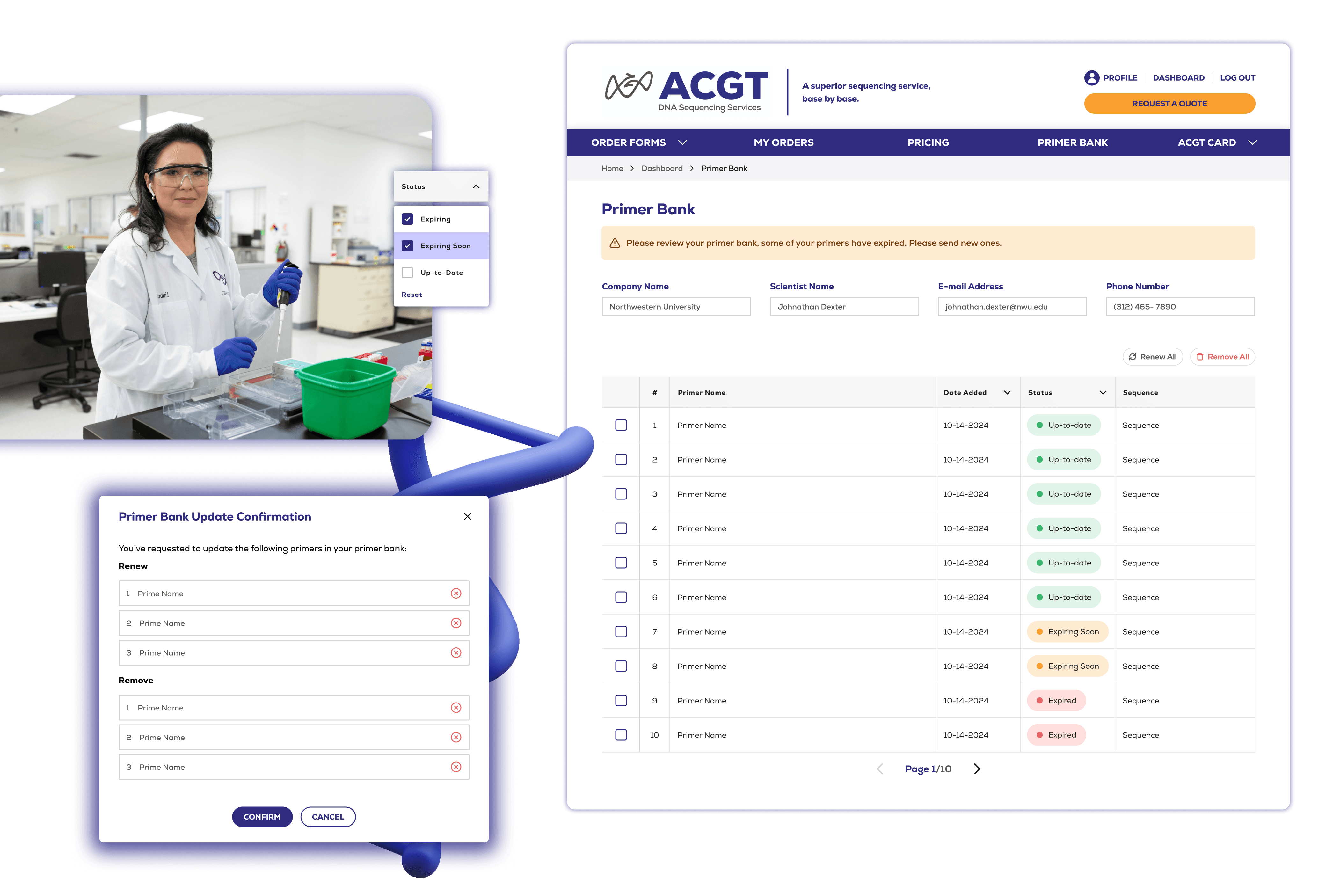
Additionally, with the added emphasis on visibility and system status, such as messaging and feedback, users are informed every step of the way. For instance, the platform now notifies users when primers are expired on the primer bank page and the dashboard.
Minimized the user's memory load by making elements, actions, and options visible, in addition to providing easy access to helpful information and documentation needed to make decisions. Additionally, incorporated a verification step to each form for error prevention and provide users with a consolidated method to review data before submission.
Customers can check the status of primers in their primer bank, sort by date added and filter by status as well as delete or renew primers as needed directly from the platform. Previously, users needed to identify which primers are expired or expiring and email the ACGT team separately to update their primers.
Improved overall usability and accessibility metrics.
The ACGT dashboard redesign successfully addressed major usability issues, resulting in a more intuitive and user-friendly experience leading to increased user satisfaction and streamlined user workflows based on initial usability testing.
I am currently in the process of collaborating with the development team to ensure a seamless launch and will continue to test the platform over the next few months and work closely with the team to track metrics and iterate as needed.
