Podcast Brand Design

The Inside Joe is a free-flowing conversational podcast hosted by Chicagoans Joe Yoon and Andre Rodriguez, two adults in their 30s who met while working at a financial company striving to introduce more creativity and thoughtful comversations into their lives. They started their podcast to do just that. Through curated topics and guest speakers, the podcast dives into the adventures, challenges and mishaps of being a millennial adult in the US.

Timeline

4 weeks

Industry

Podcasts

Platform

N/A

Year

2021

Stack

Logo
Logo
Logo
Logo
Logo

Scope

Research, Branding, Visual Identity

Intellectually Playful

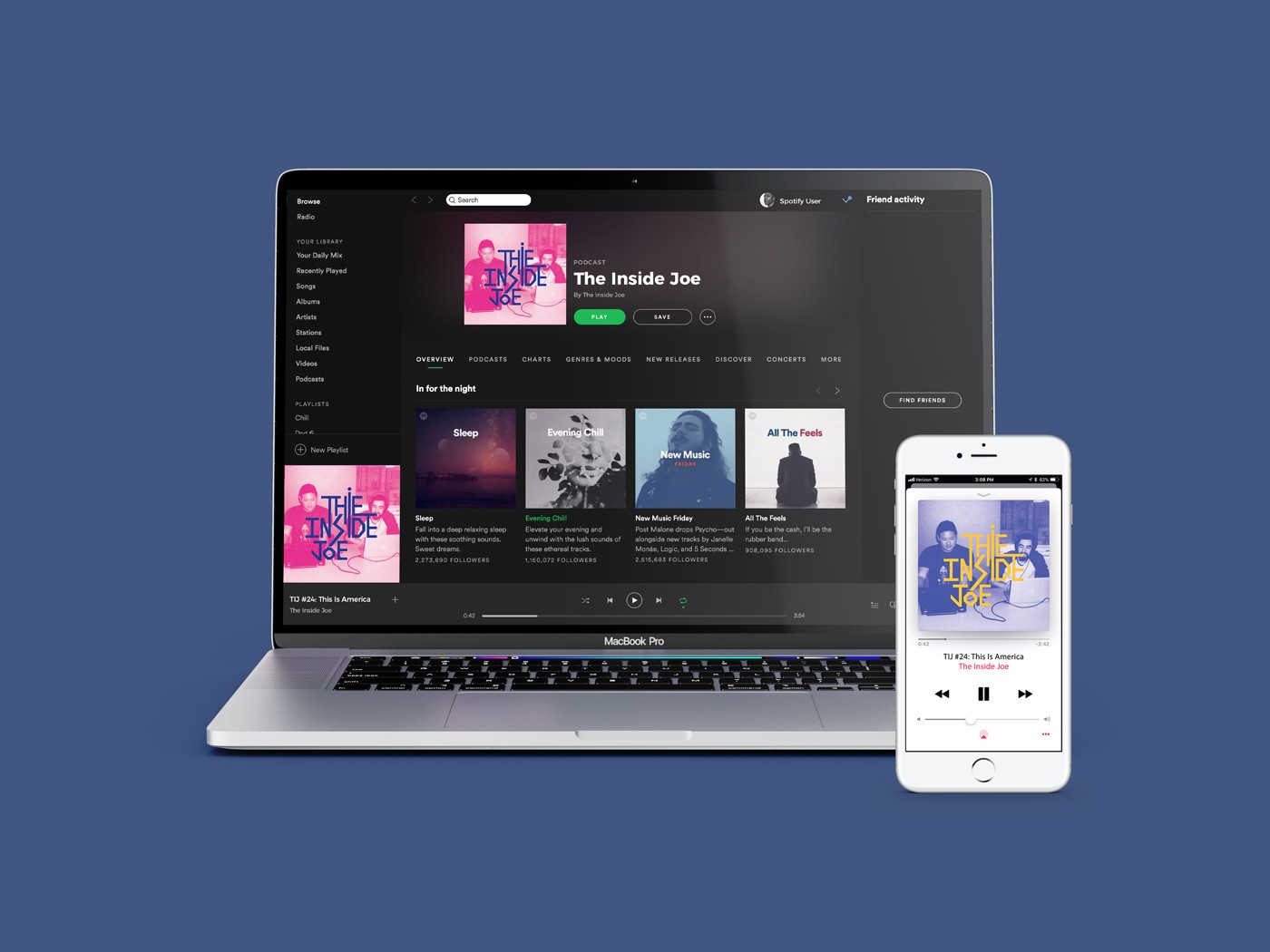
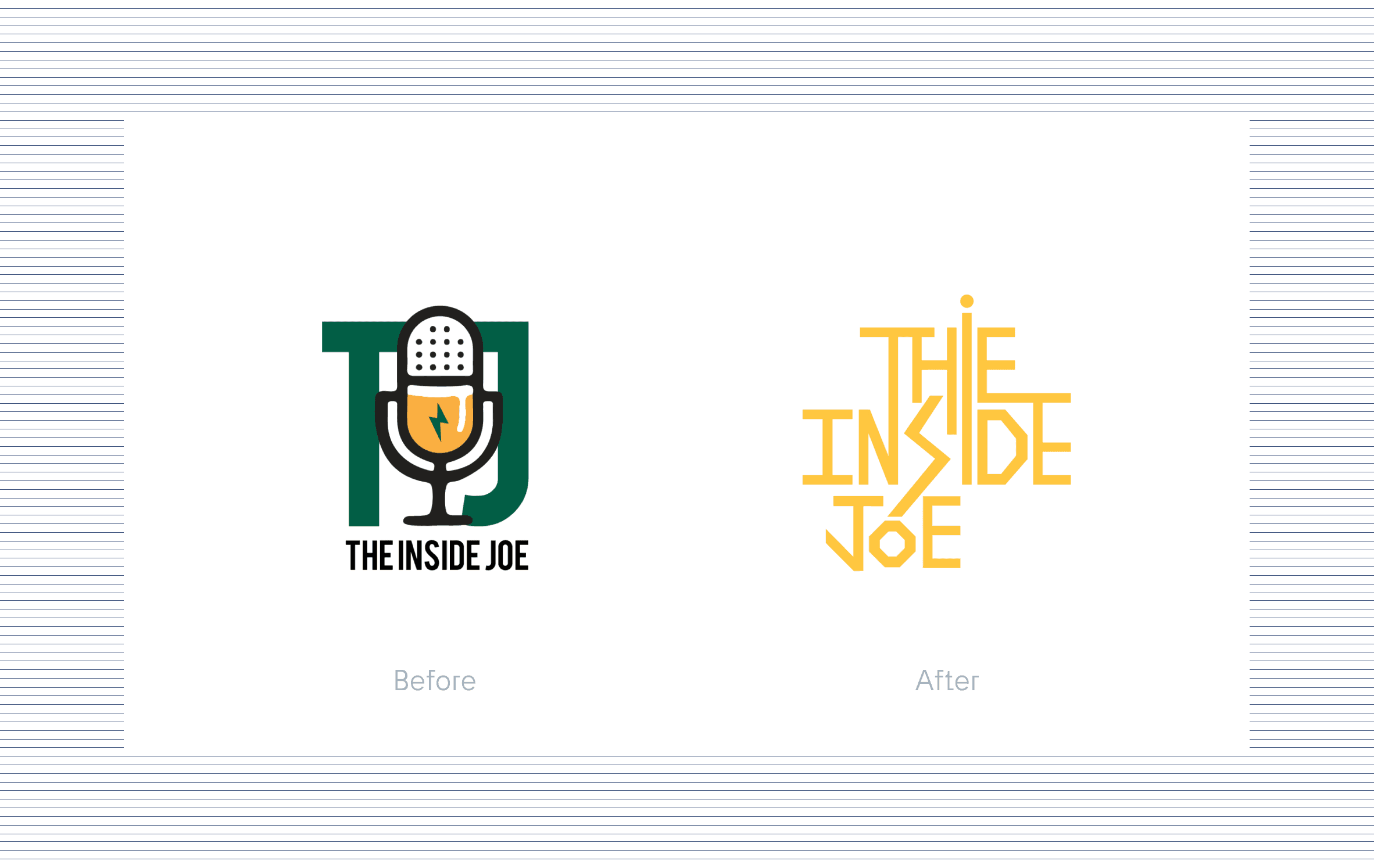
Given the light-hearted, informal and raw nature of the podcast, Joe and Andre wanted to rebrand The Inside Joe to truly represent the heart and soul of the show. The original logo was a far departure from the podcast’s essence, and did not represent the youthfulness and authenticity that The Inside Joe represents. The goal is to attract a younger and more diverse audience, and to give The Inside Joe the genuine, candid and raw visual identity that matches the nature of the show and its hosts.

From Generic to Edgy

The approach to redesigning The Inside Joe's logo stemmed from the desire to reflect their edgy style and tone and steer away from the generic representation of their previous logo. The content and topics that they cover are playful and somewhat abstract, and their brand image needed to reflect that. The decision to create a dynamic, geometric and punk-inspired logo came from conversations with both Joe and Andre. This allows for a logo that is efficient, effective and dynamic in nature that can live seamlessly across various platforms and applications.

The approach to redesigning The Inside Joe's logo stemmed from the desire to reflect their edgy style and tone and steer away from the generic representation of their previous logo. The content and topics that they cover are playful and somewhat abstract, and their brand image needed to reflect that. The decision to create a dynamic, geometric and punk-inspired logo came from conversations with both Joe and Andre. This allows for a logo that is efficient, effective and dynamic in nature that can live seamlessly across various platforms and applications.

The approach to redesigning The Inside Joe's logo stemmed from the desire to reflect their edgy style and tone and steer away from the generic representation of their previous logo. The content and topics that they cover are playful and somewhat abstract, and their brand image needed to reflect that. The decision to create a dynamic, geometric and punk-inspired logo came from conversations with both Joe and Andre. This allows for a logo that is efficient, effective and dynamic in nature that can live seamlessly across various platforms and applications.